Discover the meaning behind the 1INME logo and how its iconic design embodies the platform's unique features, with the blue and red color scheme and focus on the number 1.
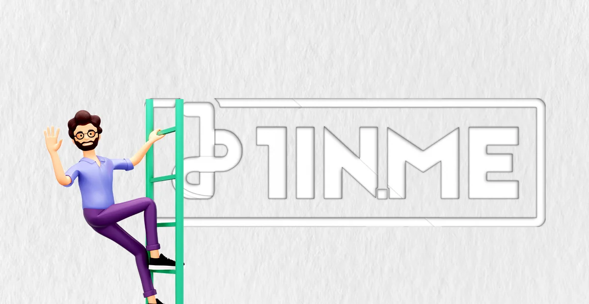
The 1INME logo is more than just a catchy design; it's a representation of the brand's mission and identity. At first glance, the logo seems simple: a white number "1" enclosed within a rectangle border with the blue "link" icon underneath. However, upon closer inspection, the logo reveals several key elements that reinforce the company's core values and purpose.
The most prominent feature of the 1INME logo is, of course, the number "1." This symbolizes the company's commitment to providing a singular, streamlined solution for managing and optimizing an individual's online presence. By consolidating multiple links into one easily accessible "biolink," 1INME allows users to present a cohesive and professional image to their audience. The number "1" also emphasizes the brand's focus on efficiency, simplicity, and excellence.
Another essential element of the 1INME logo is the rectangular border that encloses the number "1." This shape is reminiscent of a profile card or business card, indicating that 1INME is a tool for creating a polished and professional online presence. The rectangular border also provides a sense of structure and stability, reinforcing the idea that 1INME is a reliable and trustworthy resource.
The blue "link" icon below the number "1" further reinforces the company's mission of simplifying online presence management. The link icon represents the core function of the biolink: linking multiple pages or sites together into a single, easy-to-use interface. The blue color of the icon signifies trust, security, and reliability - qualities that are essential for any service that deals with personal and professional online presence.
The logo's color scheme, which combines blue and red, is also significant. Blue, as mentioned, represents trust, security, and reliability. Red, on the other hand, is a color associated with passion, energy, and action. The combination of these two colors emphasizes 1INME's commitment to providing not only a reliable and trustworthy service but also a powerful and action-oriented one. The color combination is also visually striking, making the logo memorable and instantly recognizable.
In conclusion, the 1INME logo is a visual representation of the brand's core values and mission. By utilizing the number "1," rectangular border, blue "link" icon, and striking color combination, the logo communicates 1INME's commitment to providing a streamlined, reliable, and powerful solution for managing online presence. The logo is not just a design; it's a symbol of 1INME's purpose and identity.